Operation Homecooked Mobile Device Lab
TL;DR — I'm a web developer nerd that wanted to test my sites on multiple devices at once. So, I built a thing to do that.
Background
I'm the in-house web developer at an excellent CPA firm in Southern Arizona. I build/maintain all their web properties - internal and external. As it stands, all but our main site are responsive and feel modern-enough.[1] Our main site is based on a non-responsive WordPress theme I chose (D'oh!) in 2010 that's been heavily customized over the years[2]. It needs a major responsive redesign - yesterday! Based on other job responsibilities/projects, I haven't had time to focus on it until now. As I really started to stare the project down, I started to wonder how I'd make sure the new theme looked right across different devices.
Devices
The proper way to go about this would be to identify 'target devices' currently used by our visitors via our analytics provider of choice. However, at least initially, I'm attempting to do this on my own dime aka «on the cheap» ... so, I'm using whatever I can get my hands on. Right now, I have access to:
- iPad w/ Retina screen (provided by employer)
- iPhone 5s (provided by employer)
- Kindle Fire
- Droid X
Use what you can! Perhaps you own an Android phone... Tell your friends what you're doing and ask if you can borrow a previous-model iPhone that they're not using or something. I'm hoping to get my hands on a newer Android device or two - especially if they're different screen sizes. I'm debating whether or not to send an email to the firm asking folks to donate a dusty device or two.
Available Solutions
Thankfully, we're able to hop on the internet and look up how other folks have solved similar problems. After poking around the web, I found a cool project/movement called Open Device Lab. It aims to highlight device labs that are open to public use for free and encourage the creation of more. It's certainly a very cool idea; one that I think could be a really cool addition to any of the co-working locations in downtown Tucson. However, it's an idea I don't think I can pitch w/o having a working example to demo.
The well-made, professional solution
I'm just gonna leave this here and say, yeah... looks really nice.
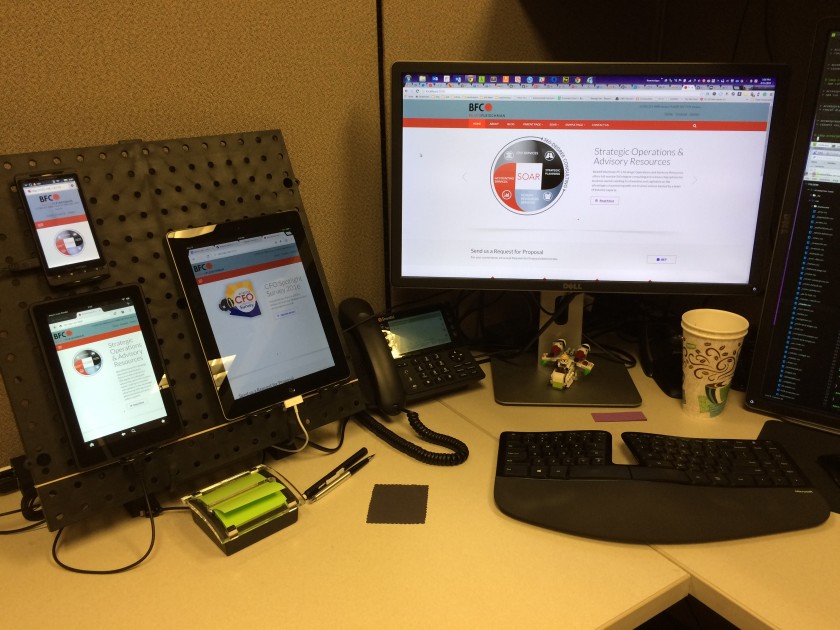
My improvised solution
Stand hardware
Items from Home Depot & Amazon:
- 16in. x 16in. Black Plastic Pegboard
- Pegboard Plier Holders (4-Pack)
- Guitar Hero guitar stand - embarrassing, but it works well.
- CHOETECH 50 Watt 6 Port Desktop Rapid USB Charger

Note: If you anticipate needing to test more than 4-5 devices, you may want to double up on these items. The beauty of the pegboard used in this build is that it's designed as an expandable system. Two of them will lock together really nicely with a couple screws.
Software
There are two pieces of software magic that make this setup work beautifully.
DesktopServer by ServerPress
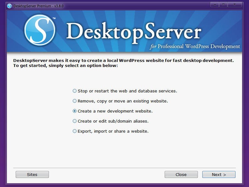
You can certainly pull off this setup with any local web server stack (MAMP, LAMP, XAMPP, VVV) or with ServerPress' free version, DesktopServer Limited, however, I want to point out that after using that version for a few hours one day a couple months ago, it was enough to convince me to upgrade to their fully-featured DesktopServer Premium version. I have not been disappointed.
DesktopServer allows you to quickly and easily generate optimized WordPress projects that run locally. Prior to DesktopServer you would have had to install a LAMP stack, edit multiple configuration files, create databases, create security credentials, and repeat the process for each new project or site you wanted to run; a painful time consuming and unfriendly process for non-developers and seasoned programmers alike. DesktopServer diminishes mundane tasks and is preferred even by advanced developers who like to tinker with WordPress Multisite based projects, domain aliases, and host files.
ServerPress has done a great job putting together a software package for Mac or Windows that lets you run a local version of your sites quickly, with very little fuss.
ServerPress' Videos
For more information on how DesktopServer can exceed your needs, hit their YouTube channel!
BrowserSync
If DesktopServer is the cake, BrowserSync is the frosting. It allows you to inject live-updating code into your pages and then sync scrolling, mouse clicks, and form input across any browsers viewing the URL on the same network. No more saving your code, switching to each browser you're testing in, and refreshing the page. It refreshes each connected browser automatically. It's free, open source, and ridiculously wonderful.
I've got it hooked into my Gulp build process. PHP, JS, and SCSS files are watched, compiled/concated on-save, and all connected browsers are refreshed w/ the latest changes.
Here's the gulpfile from one of my projects:
Solving Real Problems
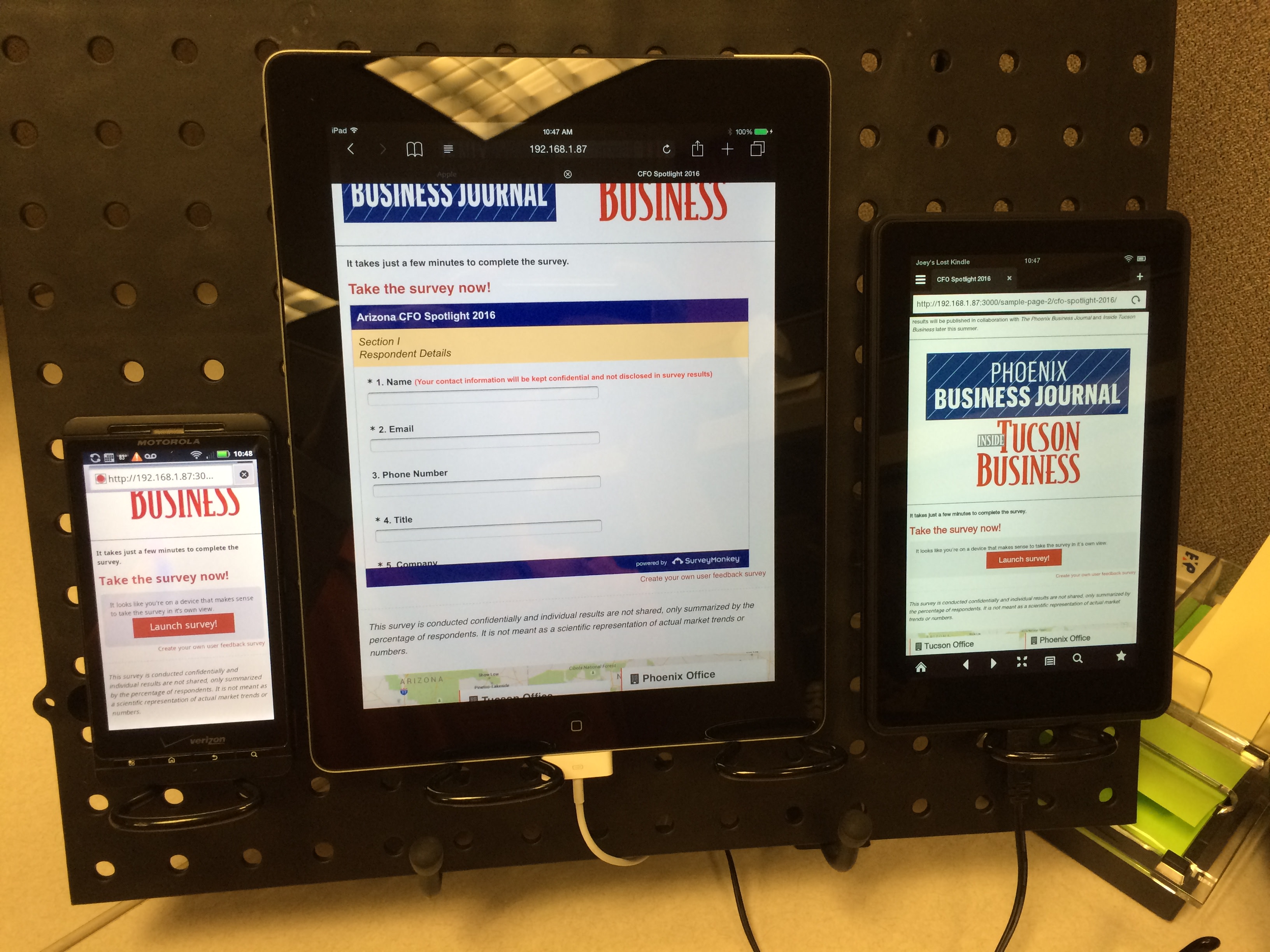
Using the hardware and software covered above, I was able to tackle a pain-in-the-butt issue last week. Long story short: we had embedded a survey (thanks Survey Monkey) into a dedicated, responsive landing page on our site. In testing, the survey loaded when viewed on an iPad or any computer... but it wouldn't show up on any phones we tried. Using the device lab, I was able to discover that Survey Monkey's embed javascript was specifically NOT rendering the form on any devices with a screen smaller than 760px wide. From that Ah-ha moment, I was able to build a 'warning' pane that would only show up on the smaller screens offering to launch the survey in a new view.
BOOM! Problem solved!
Future Plans
Obviously, the goofy Guitar Hero stand needs to be replaced by a sturdy solution of some sort. It does the job for now, but I've already spent some time sketching out some ideas for a wooden frame (with room for two panels mounted together - I went ahead and bought another one :)).
For now, version 1 works really well for me.
I'll definitely add photos of version 2 when it gets to that point. Perhaps that'll be one I can replicate down at CoLab Workspace or Connect Co-working?
Footnotes
Everything changes so fast on the web, I don't dare declare anything modern or 'done'. ↩︎
A year or two after launch, we added a mobile device sniffer and have been redirecting that traffic to a /mobile/ subdir... which has worked well-enough. But it's 2015, dangit! Time for a completely mobile-friendly approach. ↩︎